
Margaret Calvert: The Visionary Who Defined Britain's Visual Identity
Nestled within the ground floor of her Islington terrace house, Margaret Calvert's studio remains a sanctuary of traditional craftsmanship. Filled with road signs, modernist chairs, and the tools of her trade, she continues to draw by hand using coloured pencils, ink pens, and gouaches. "There was no such thing as graphic design back then," she recalls. "It was just called commercial art."
A Legacy Etched in Type and Symbol
Few graphic designers achieve the honour of having a typeface bear their name. While 18th-century Italian Giambattista Bodoni secured such immortality, his work famously drew criticism from William Morris for its "sweltering hideousness." Calvert, however, has earned her place in the graphic design pantheon through creations that have become civic landmarks.
The Calvert typeface, designed in 1971 for a French new town but rejected for being "too English," now graces the Tyne and Wear Metro system. Its black M on a yellow background has become an iconic symbol across north-east England. Described as having "vitality and elegance, avoiding the stiff and mechanical," the typeface reflects the woman who created it.

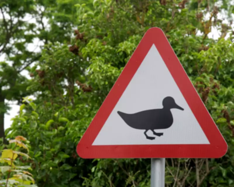
Revolutionising Britain's Road Network
As Calvert approaches her 90th birthday, her extraordinary career continues to influence daily life across Britain. Her most significant contribution remains the road sign system developed with Jock Kinneir during the late 1950s to mid-1960s. This ambitious project unified and rationalised what had become a confusing array of lettering styles, colours, and layouts across Britain's expanding road network.
Officially implemented in 1965 and largely unchanged since, their signage created "a house style for Britain" that embraced modernity with the aim of improving everyday life. Design historian Robin Kinross praised the project for highlighting "the role design could play in public life," making roads safer and driving more pleasurable for generations.
Iconic Pictograms with Personal Touches
Calvert designed many of Britain's familiar warning symbols, drawing inspiration from unexpected sources. The careering deer and cantering horse silhouettes were influenced by Eadweard Muybridge's pioneering photography. The static cow representing farm animals was based on a real bovine named Patience from her childhood visits to a relative's Wiltshire farm.
Perhaps most personally, Calvert herself appears on the children crossing sign as a girl with distinctive bobbed hair leading a smaller boy across the road. Kinneir, who taught Calvert at Chelsea College of Art and later invited her to join his practice, described her as "the student who applied herself most rigorously to what she was doing. She kept her head down and worked like a maniac."
From South Africa to Design Leadership
Born near Durban, Calvert arrived in Britain as a teenager in 1950. After studying at Chelsea College of Art, she joined Kinneir in his cramped Knightsbridge office, which one client described as "A man, a girl and a hole in the wall." By 1964 she had become a partner, designing everything from luggage labels and posters to Gatwick airport signage and British Railways identity systems.
Following Kinneir's retirement in 1980, Calvert embraced teaching at the Royal College of Art for nearly forty years. "Graphic design was thought to be a man's discipline," she notes. "So I think it was quite a surprise for people to find me there." Her teaching emphasised critical thinking and exploration beyond traditional graphic boundaries.
The Transport Typeface: A Digital Evolution
The Transport typeface, created by Calvert and Kinneir for their road signage commission, has become possibly Britain's most familiar font. Its migration into the digital realm saw Calvert collaborate with former student Henrik Kubel to create New Transport, used on the gov.uk website since 2012.
This digital adaptation proves the enduring appeal of their original vision, though its creation faced significant resistance. Traditionalists challenged both the sans serif design and use of lower case letters, leading to what Calvert describes as the "Battle of the Serif." Extensive trials eventually saw modernity prevail.

A Life in Design: Looking Forward
Calvert's career is celebrated in her new book Woman at Work, which intertwines her personal story with the history of postwar British graphic design. The cover features a playful adaptation of her "men at work" pictogram, incorporating her signature bobbed hair and a skirt.
Despite her achievements, Calvert remains characteristically modest. Much like her work, which prioritises human-centred design without calling attention to itself, she focuses on the process rather than personal recognition. "Design for me is a process," she explains. "It's about improving things. Basically, it's head, heart and hand."
As exhibitions in Kyoto and London's Design Museum showcase her work, and a documentary about British road signage receives its UK premiere, Calvert's influence continues to shape how Britain looks and functions. From warning drivers about ducks crossing roads to guiding millions through transport systems, her designs have become an integral part of the national landscape.