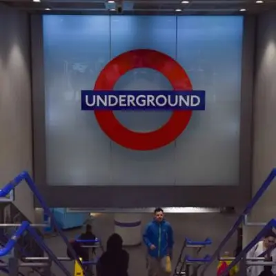
A new live map shows every London tube, train, bus and plane in real time. Unleash your inner transport nerd on this beauty, created by London-based transport enthusiast James Potter.
London's tube map is a design classic because its interwar creator, Harry Beck, took the then-radical step of taking the messy, wibbly-wobbly intricacies of real-life train routes and turning them into something streamlined and neat. Since he created his masterwork in 1931, most visions of the transport network have followed suit, giving us straight lines in bright colours. But now, a lone maverick has created an altogether different kind of map of London's many forms of transport.
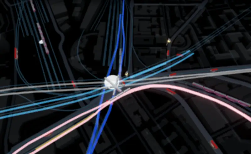
London-based transport nerd and serial tinkerer James Potter has created a live 3D map of the city's entire transport network pulled from TfL's live feeds, National Rail departure boards, aircraft transponders and ship signals. It's complex and fiendishly accurate, with routes snaking their way through the city in all their erratic glory, through grayscale-shaded city streets. And it's a snooper's dream, meaning that you can actually see trains, buses, boats and even planes making their way around the capital in real time.

Ever wondered why the traffic outside Waterloo station is so hectic? Peer at the map and you'll see a solid queue of little red buses permanently making their way down this busy transport thoroughfare. Curious about what the deal is with that funny-looking boat, steaming its way down the Thames? This map will give you its name, class, dimensions, and country of origin. Suspicious that your friend isn't really '10 mins away'? Have a nose about and you'll see whether there's actually a Thameslink train pulling into St Pancras International, or whether they're still trundling through outer suburbia drinking their gin in a tin.
This map is serious supervillain stuff, making viewers the spider at the centre of a web of transport-based intrigue. But how did one amateur get his hands on this level of data? The prosaic answer is that since tube trains and buses have no GPS feed, the map works out their locations from arrival countdowns and departure boards, then animates them to show them on the real map. That means it might not always strictly represent the full, messy reality of London's transport system, with its unexpected traffic jams or red signals. Still, it's a darn sight more accurate than pretty much any other visual representation you'll find.
And best of all, it's all totally free and open-source, with no sign-up required, and plans down the line to keep on adding more data and more transport methods. So snoop in full confidence that no one's going to confiscate your digital Marauder's Map anytime soon.